Appraisers Now
Appraisers Now (Anow) is an appraisal solutions software company that signed on its most valuable enterprise client — a top US lender. The lender chose Anow to be the technology provider for their industry-leading direct engagement program. The client brought over 12,000 new users to the platform overnight. We created optimizations across the product in order to streamline the process for this client and other lenders in the future.
My Role
Over 12 weeks, I led a team of designers and developers to execute the initiative; I also directly contributed to the designs. I was in charge of the overall user experience, I upleveled the branding, and I defined the user research process.
The Challenge
Most of these users were only interested in Anow as a method to accept this particular lender's orders, so they had little to no need for most of the system's many features (not to mention they were all given free trials to get onboarded quickly). The users were very confused about the presence of elements that didn't directly contribute to their process of working with the client. Plus, it was a lost opportunity to meaningfully upgrade users since features were not paywalled appropriately.
The software needed to be flexible enough to support existing functionality for paid users and users with different clients, but we also needed to create a simple and streamlined process for this type of lender client.
The Solution
We focused on two main areas of the user experience ‐ the order details page, and the user profile. Most of the customer compliants were related to the order details page, so we created a new version and redirected to it if this particular client was selected. We hid the nonfunctional features that caused confusion, as well as hid premium features to enforce the free model.
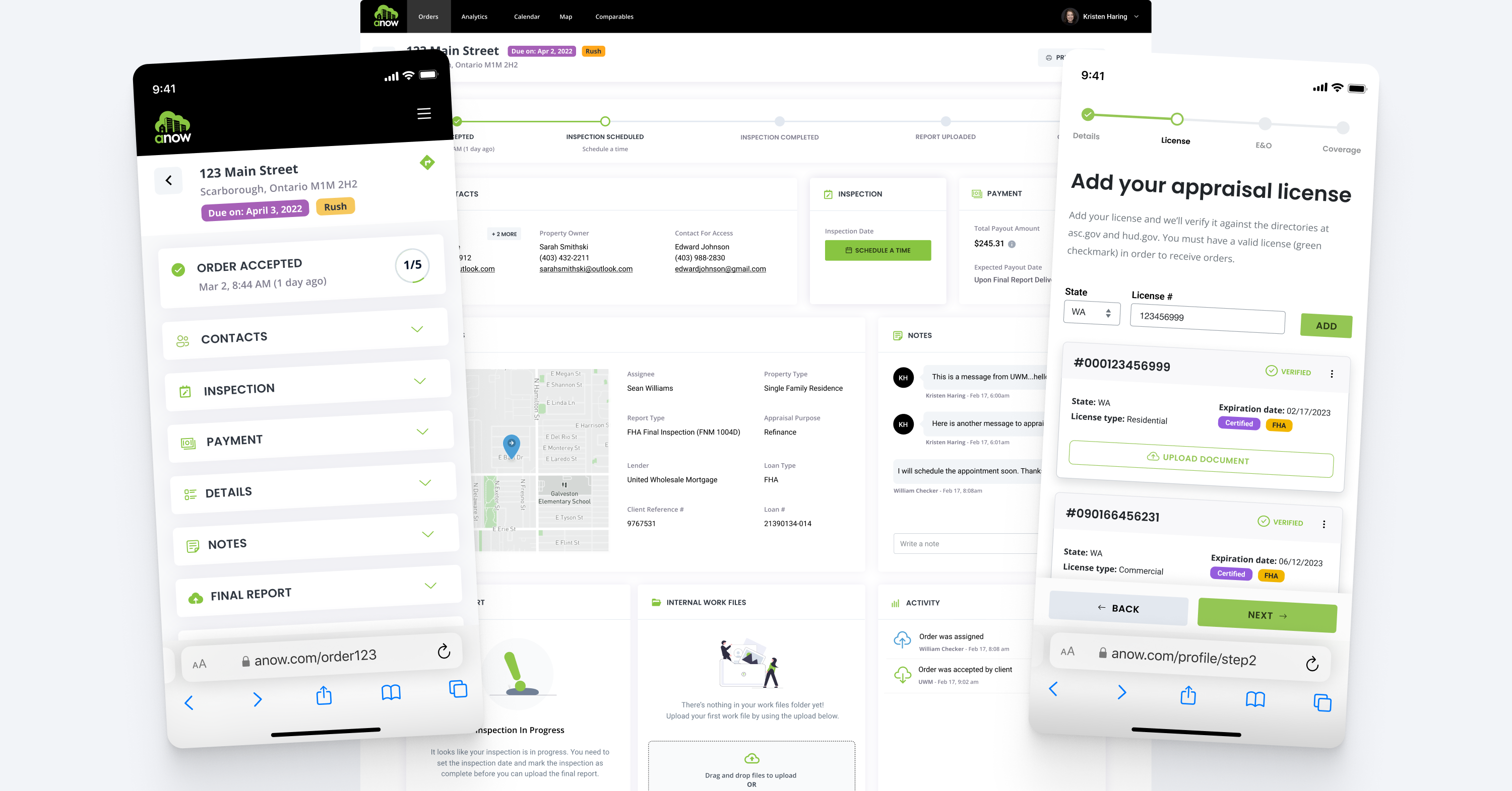
We also addressed a major user pain point related to unknown missing profile information. We created a mobile-friendly onboarding wizard to highlight the specific fields that were required when working with this specific lender.
A New Technical Approach
As the legacy main application was over seven years old, the development team decided they wanted to build these features out in a brand new application via Vercel. This would be proof of concept work demonstrating how data was to be shared between two standalone systems. There would be automatic redirects between the platforms so that it would be seamless to the end user.
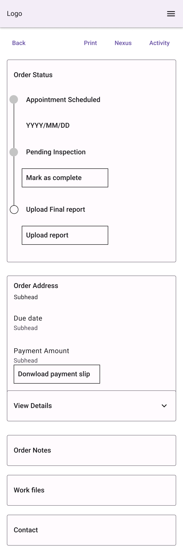
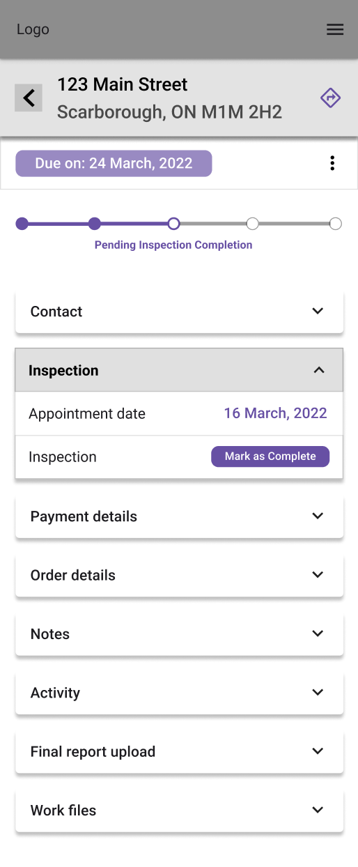
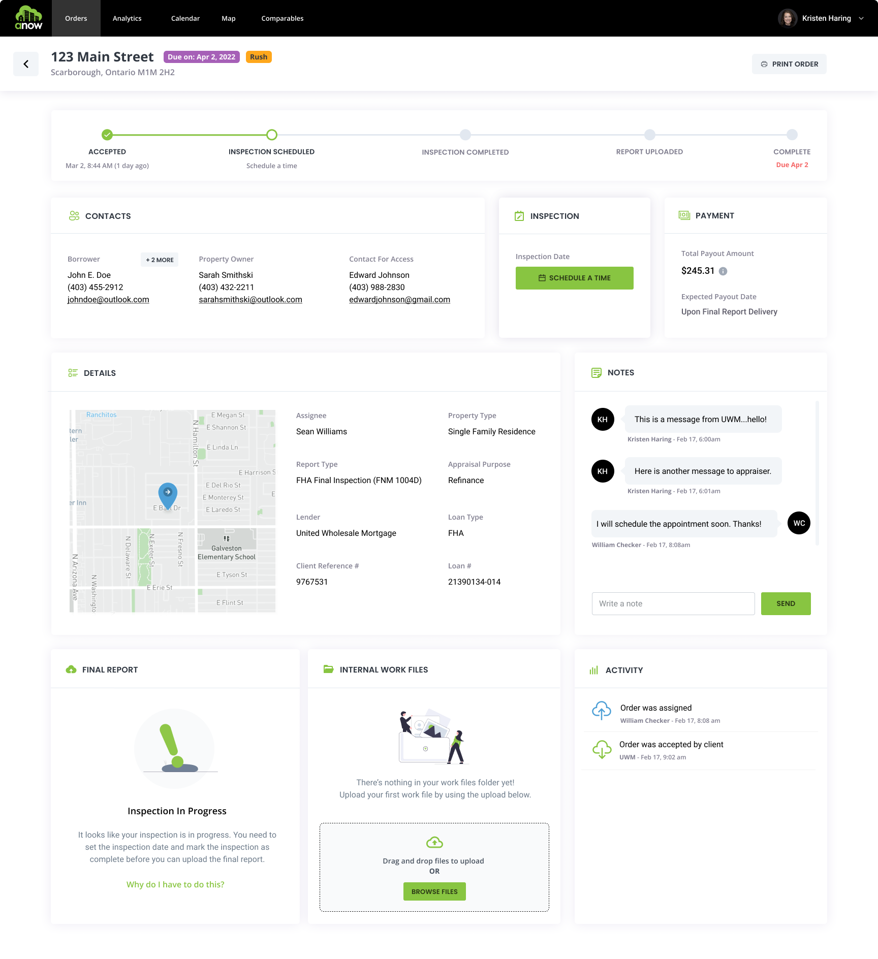
A New Order Details Page
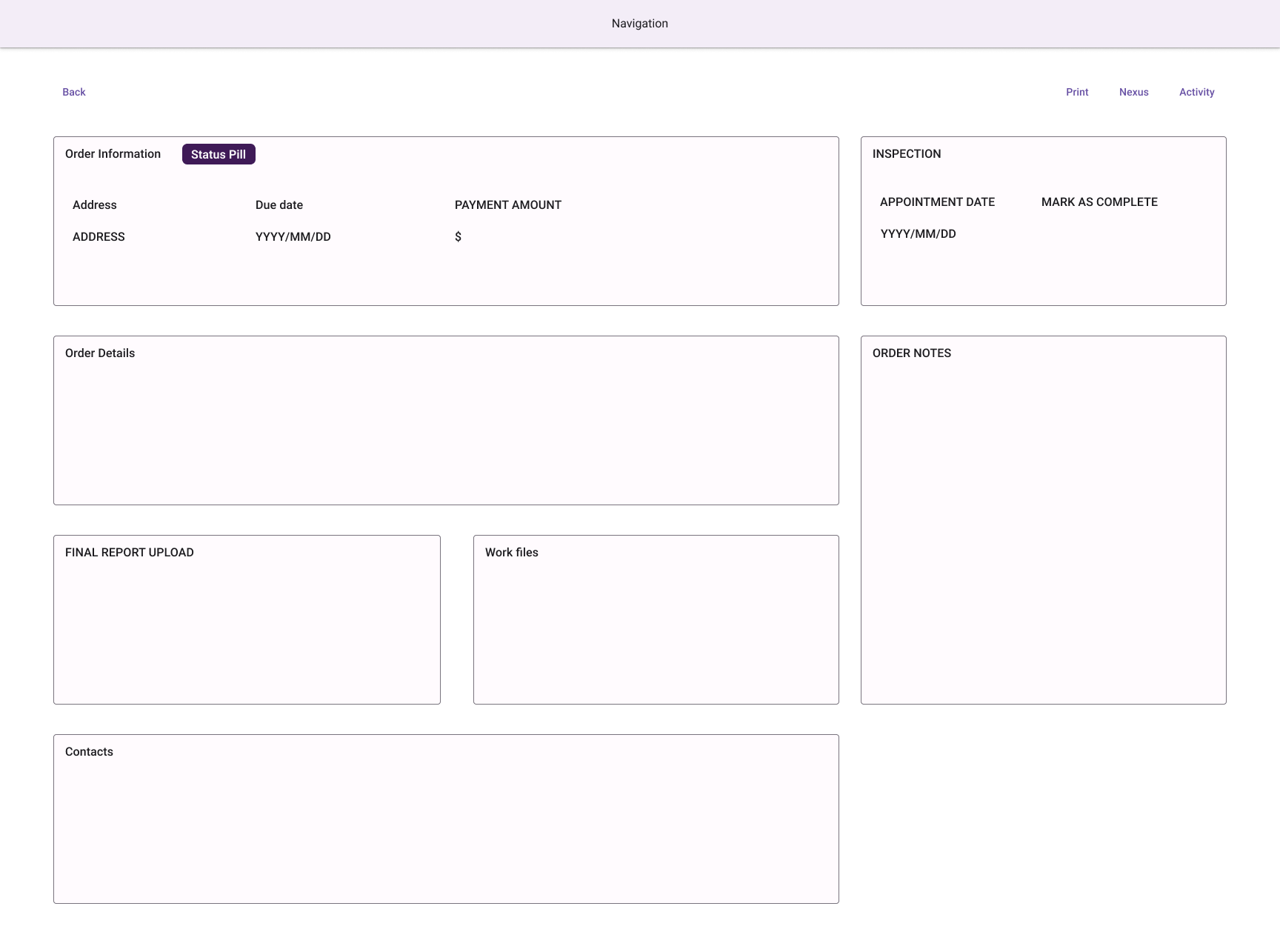
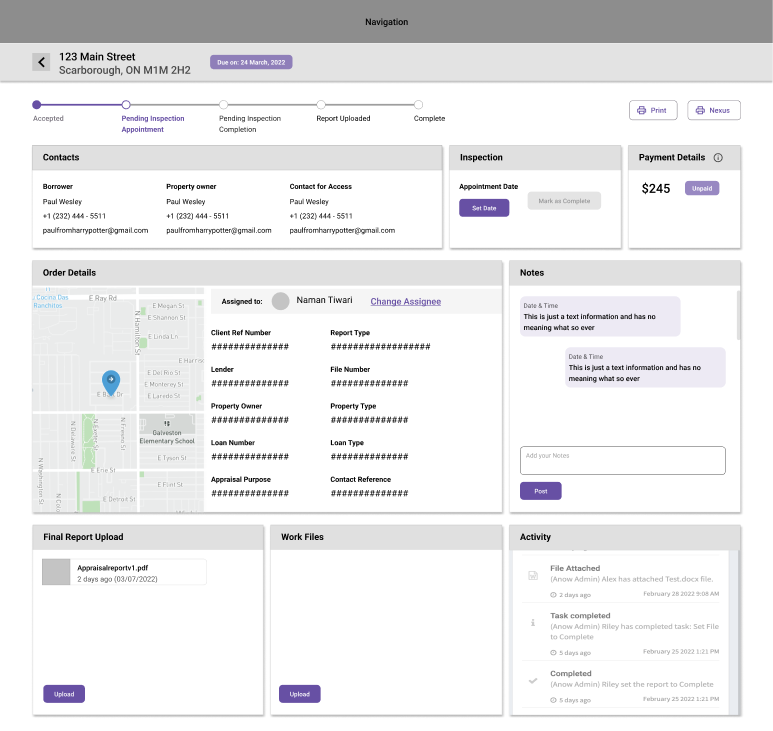
Not Accessible Nor Intuitive
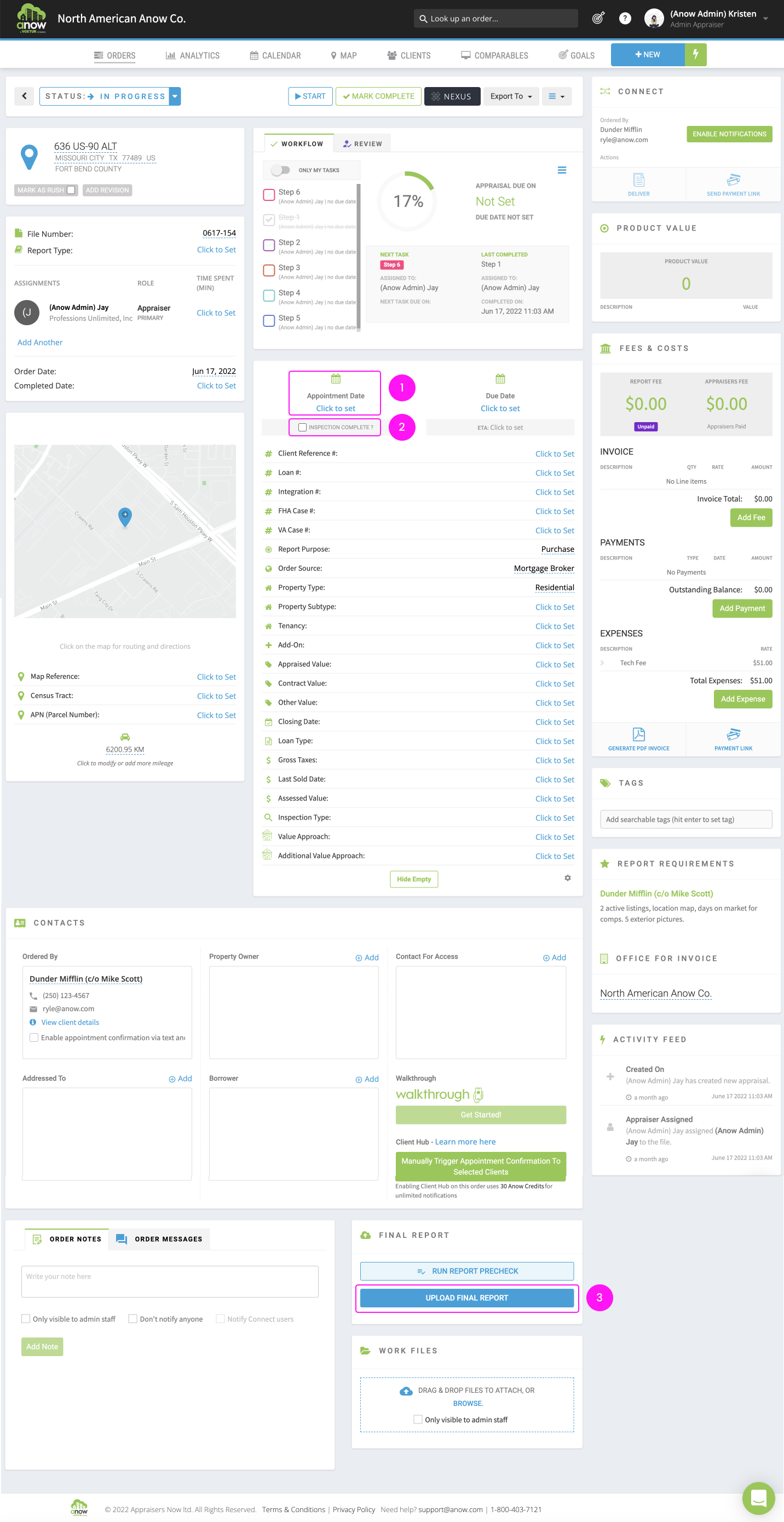
The current order details page was extremely busy with a lot of visual clutter. It was not mobile optimized so due to the length, it was a tiresome experience when on-the-run. Appraisers are known for working in the field so the feedback from customers was that they did not bother to schedule their inspections or mark them complete because it was too difficult to do so.
Non-intuitively from this page, the appraisal process is linear with a prescribed set of steps to go through. As you can see here, the main three steps of the appraisal process are scattered across the design and difficult to ascertain.
The impact of a poor user experience led to these business problems:
- Scheduling the inspection was being missed, causing the lender to hire staff to make follow-up phone calls with the appraisers.
- Users were interacting with "dead" aspects of the page, expecting the data to be sent to the lender, but it wasn't (like re-assigning to a different appraiser or updating the appraisal fees). This caused confusion and a distrust of the system and the program.
- Report turn time, a critical metric, was high due to an inability to upload reports effectively.
- Anow's customer inbound support was sky high due to costumer confusion.
- Appraiser's scorecards were negatively affected for not following the steps completely, meaning less appraisal orders for them.
- Revision rates were higher due to missing notes from the lender or not communicating issues or changes in timeline back.
Steps 1–3 are not intuitive nor easily discoverable in the original design.

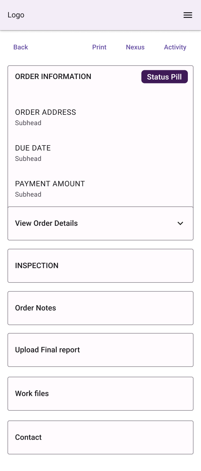
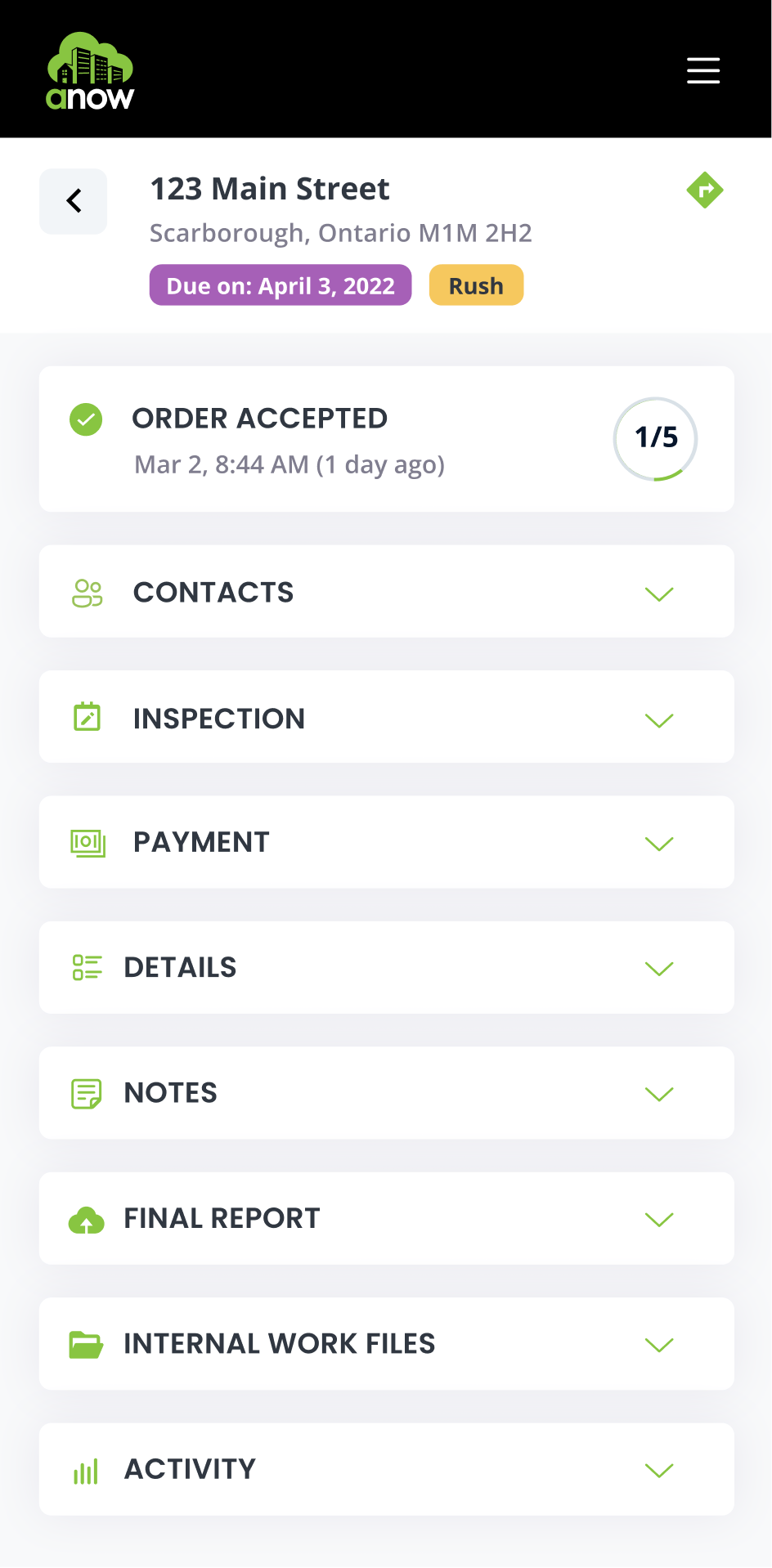
What's Left When You Remove the Cruft
I removed all of those extraneous elements mentioned earlier and here is where it landed:
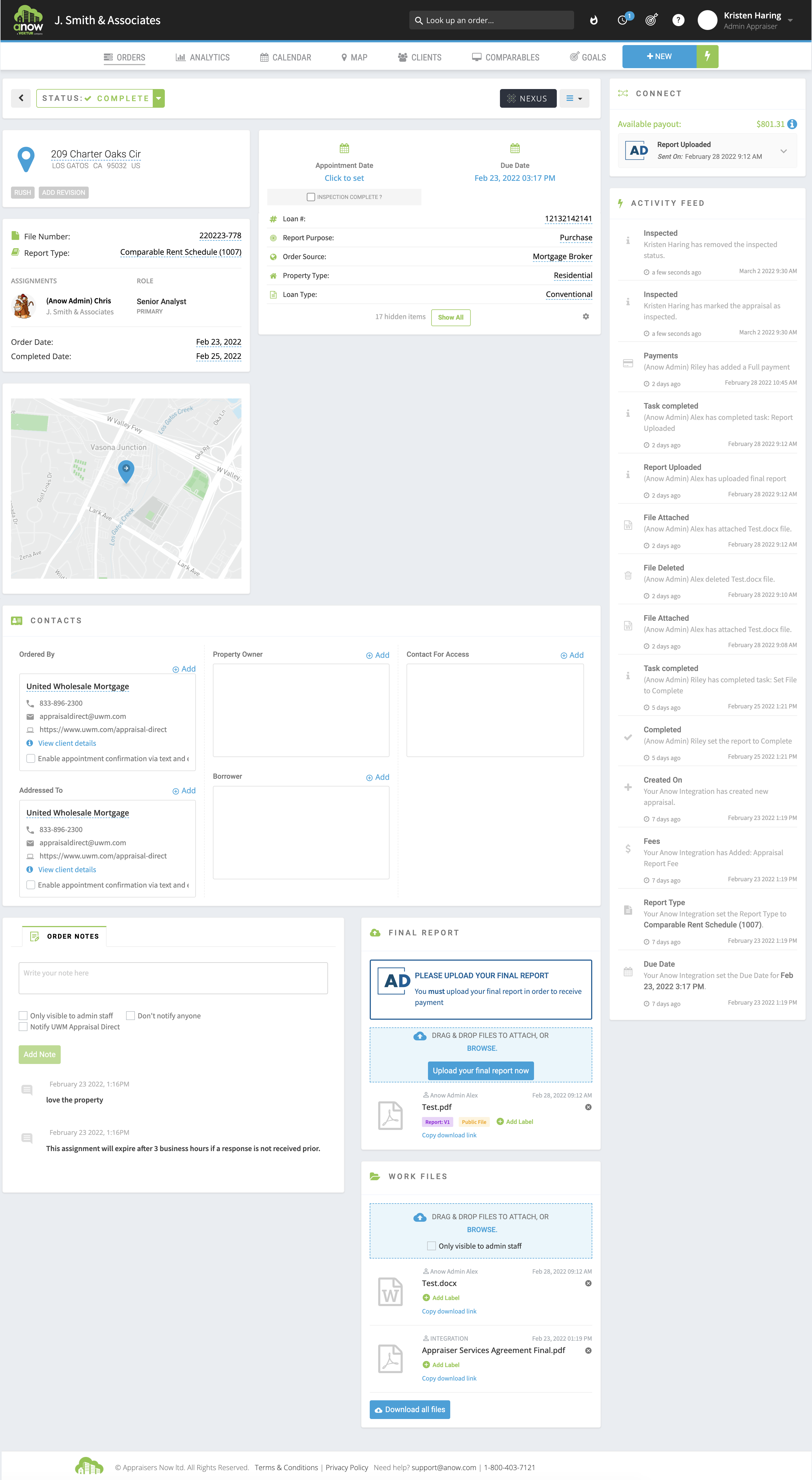
You can see that there is a significant reduction in features displayed on the page. Now it's time to analyze our users to ensure that we are building and designing the right thing for them.
Listening to Customers
I had a regular and ongoing relationship with our lender client, so it was always clear what issues our customers were having. I was the account manager for the enterprise client, so daily I heard what process issues they had, what the appraisers were experiencing, and how they felt the program was going from their perspective.
I also had a strong connection to the Anow CS team so I was hearing firsthand what experiences our customers were having, and I often was emailing and calling them to understand their pain points and helping to alleviate them.
Sharing Information
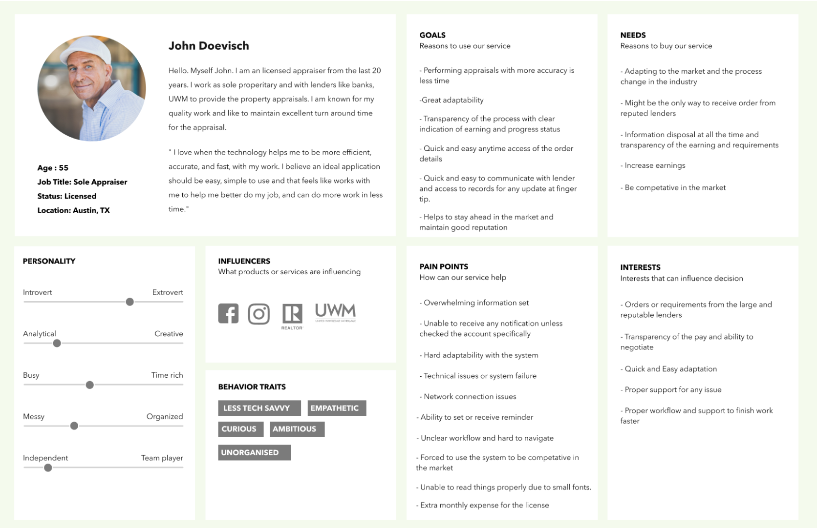
During this year we hired many new developers and designers to join our company. At this point in our team's maturity it felt appropriate to create a user persona to ensure that everyone had the same background information on our users. That way, it was clear to everyone involved who we were solving for.
A shareable user persona that identifies the main needs and motivators of a distinct user group
To the Drawing Board
There were some options as to how we wanted to approach this new page and workflow.
Using status pills to demonstrate steps in a process.
Using a traditional progress bar to demonstrate steps in a process.
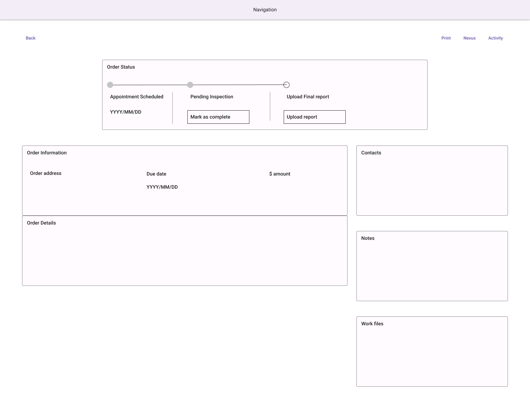
We hypothesized that by having a traditional progress bar at the top of the page, it would be a stronger visual indicator of the process and would better promote workflow compliance. With the constraint of time, we moved forward with this plan.
Harnessing Historical Feedback
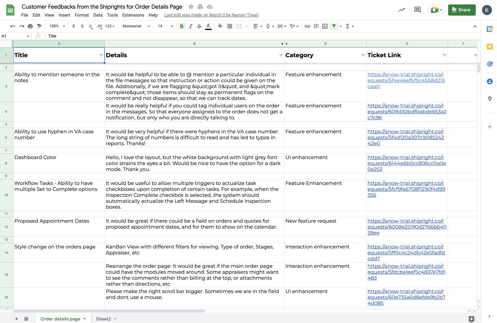
A year ago I implemented Shipright, which is a user feedback collection tool, so that we would start receiving direct feedback from our users. From this information, we identified a few improvements we could make to the order details page:
- A sticky header where the property address was located so that you have continual reference to the order you are looking at
- Darker and larger fonts to improve legibility
- A more concise mobile experience
- A stronger grid layout to reduce cognitive load
Adding Details
Our UX designer created these wireframes to demonstrate these enhancements on desktop as well as mobile.
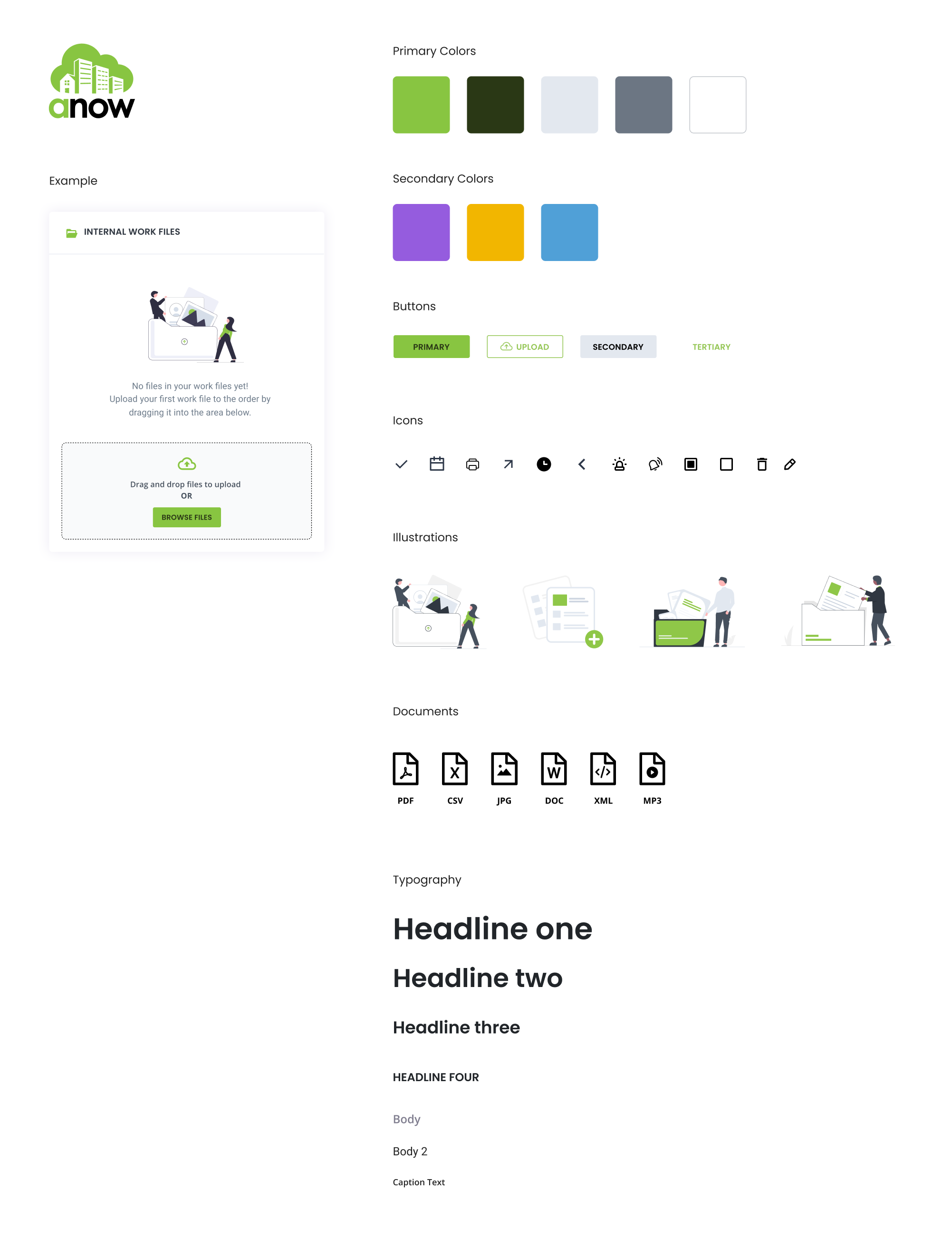
Finalizing The Page
After the UX designer completed the wireframes, I completed the visual design, which included a brand refresh.
This new style guide was used for all new Anow features within this application
Results
After our team had implemented this new order details page, the feedback was immediate from the lender as well as appraisers — they loved it!
As a result of this improvement, we saw:
- A decrease in customer support calls, chats, and emails for workflow issues
- Appraisal turnaround time was improved by 2 days (a major milestone in the appraisal industry)
- Customers reported having a better relationship with Anow and the lender program
- The lender's satisfaction improved as appraisers' attitudes improved
Despite this initial success, there was still more work to be done. Thousands of appraisers' profiles were not complete which meant that appraisers with invalid licenses were completing work, and dozens were not receiving payments for completed work. A new project had to occur to fill this gap and solve these problems.
A New Onboarding Wizard
Incomplete Profiles Caused Missed Opportunities
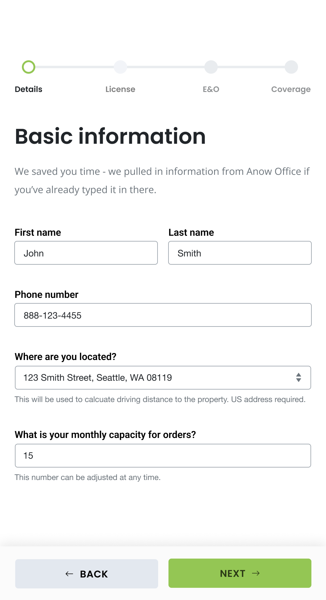
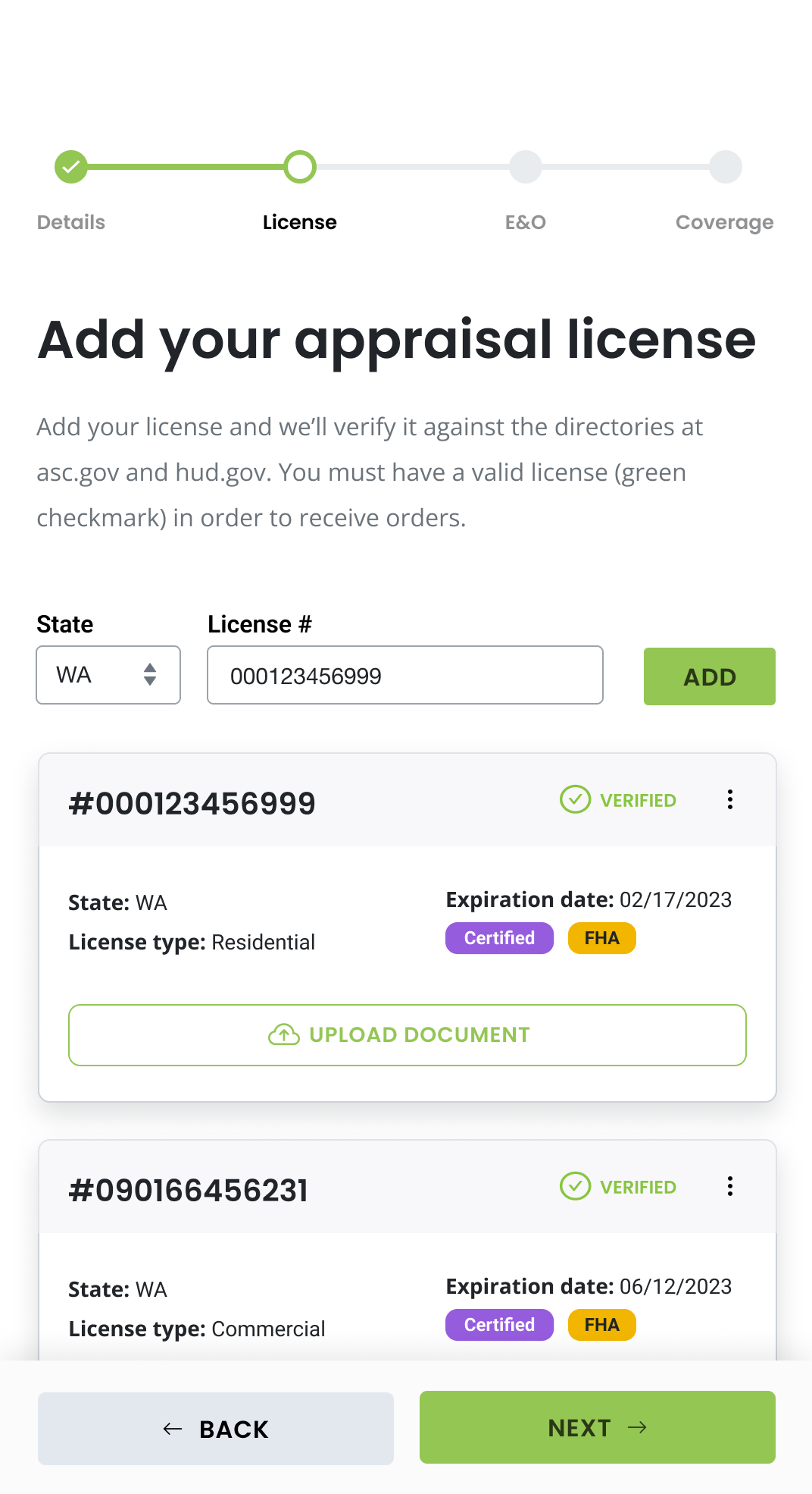
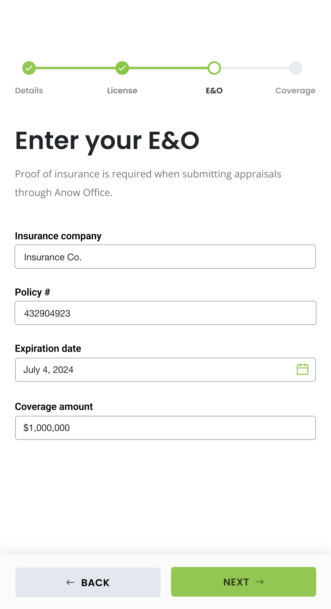
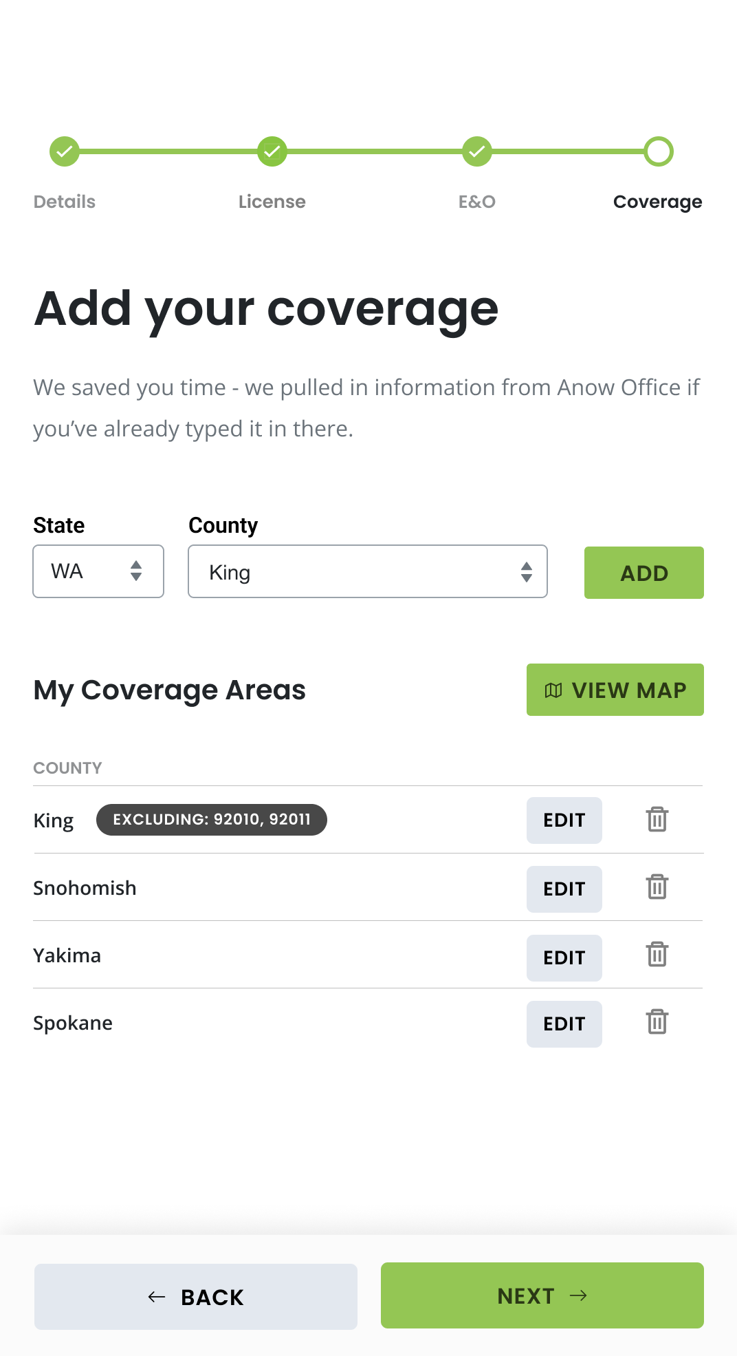
When it came to onboarding users to the Anow system, a user profile is needed but nothing is required. For working with this specific client, however, there were four items that were required for participation in the program:
- ASC.gov active licensure
- E&O insurance
- Geographic coverage
- Monthly capacity
- Stripe payment information (by the company admin)
- Handshake with the client (by the company admin)
44% of the original 12,000 users were in a situation where they had incomplete profiles, meaning they were missing out on work or they were blocked from being paid. It was business critical to improve this workflow!
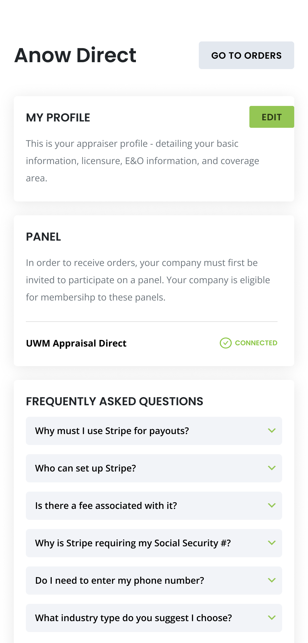
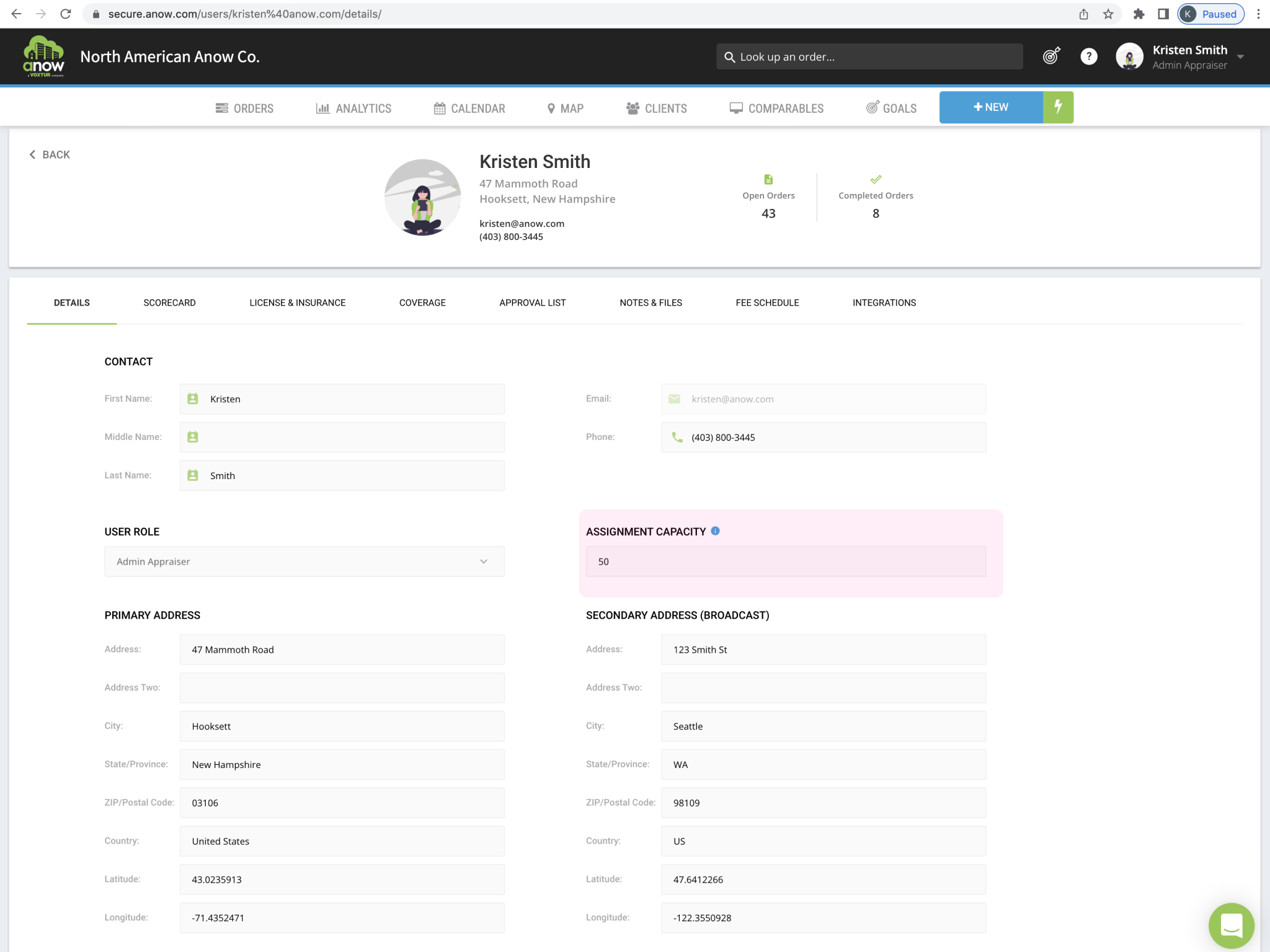
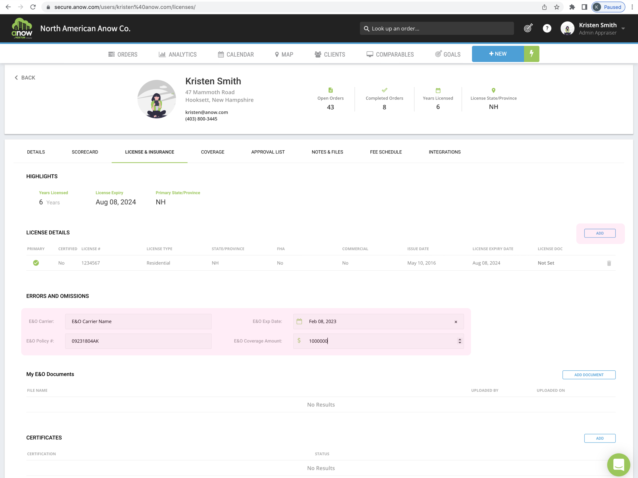
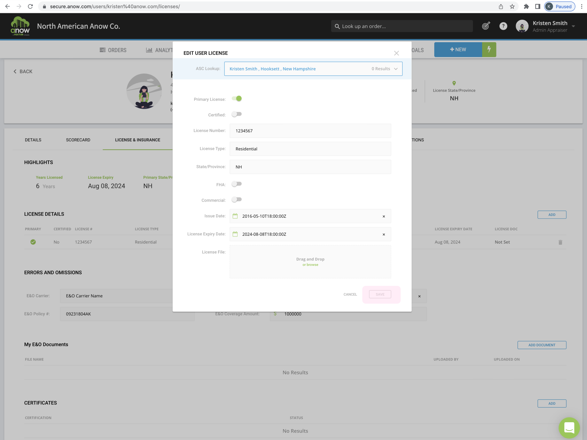
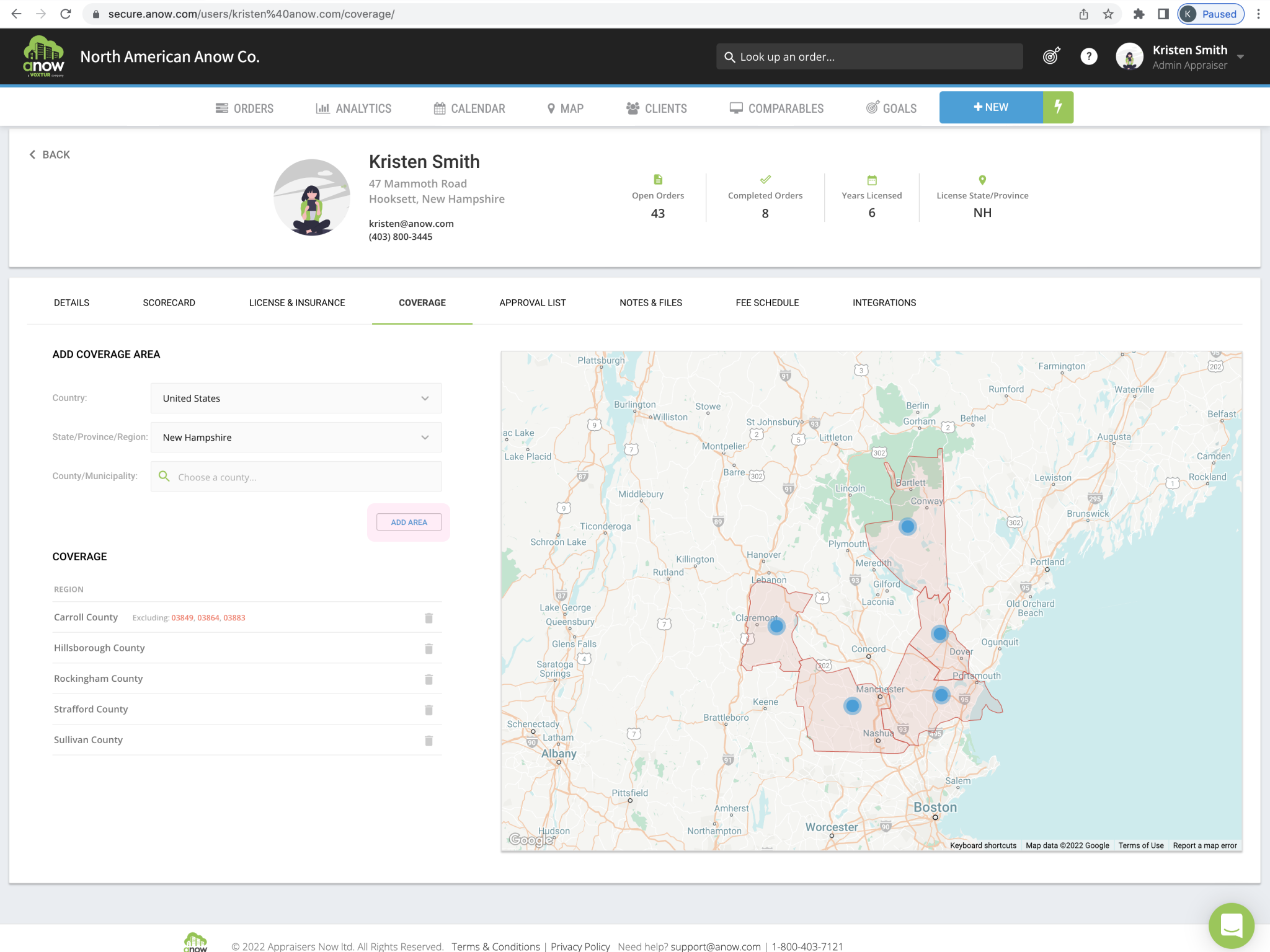
A Poor Profile Page UX
Here is what the original profile page looks like. There are a number of tabbed sections, and numerous fields with no indication as to whether they are required for working with this lender or not.
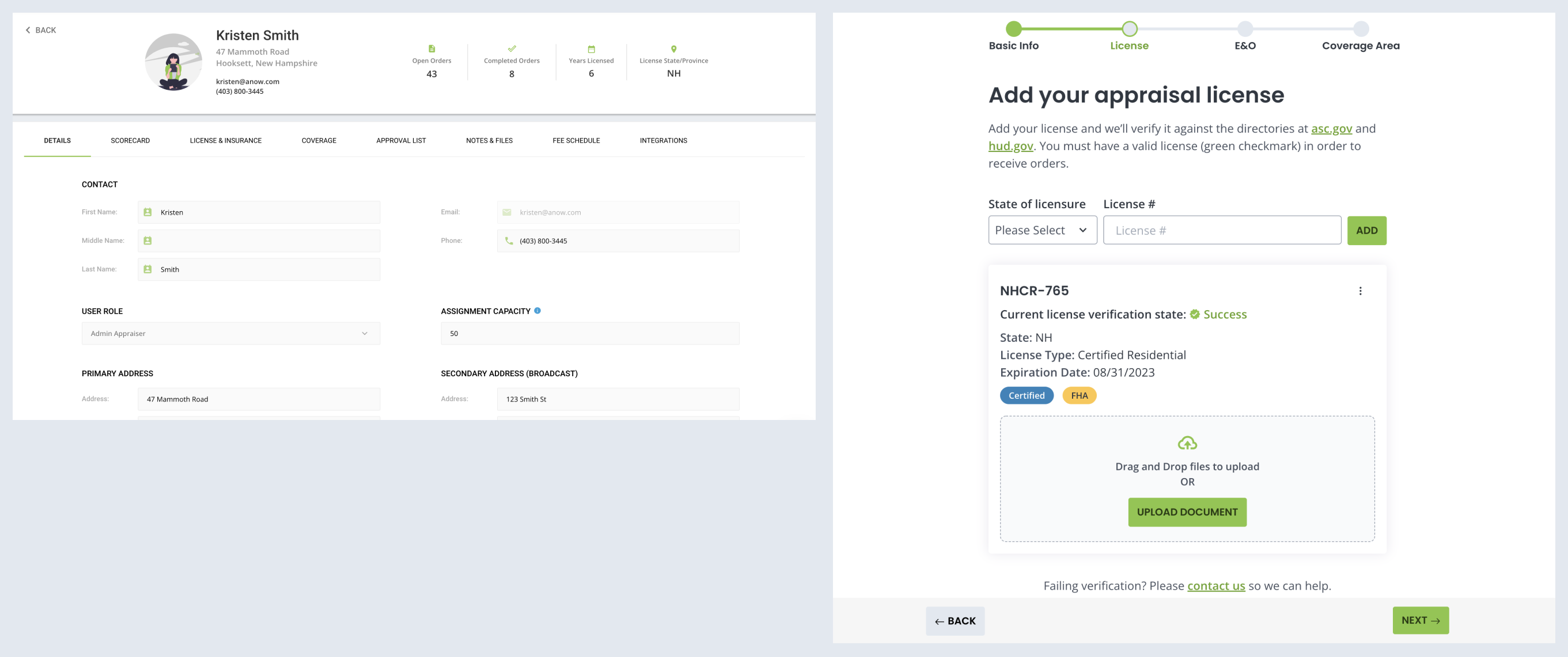
Promoting Accessibility
When applying the updated branding to the new view, you can see the improvements between the two experiences:
The Final Product
Bringing it All Together